Resources
Appendix J (Classification of the World’s Economies) of the 2017 International Comparison Program report released May 2020 (link 5 below) includes a classification of the world’s economies into four categories: low income, lower middle income, higher middle income, and high income.
From least technical to most technical, these resources talk about Purchasing Power Parity (PPP) as a metric important to consider when assessing a nation’s ability to purchase goods and services:
Make Your Prices Fair and Scalable, Globally (2015) by Jurgen Appelo at Entrepreneur – blog post in layperson terms
How to Calculate and Use Purchasing Power Parity – PPP (2020) by Kimberly Amadeo at The Balance – blog post in layperson terms with some technical language
The Big Mac index (2020) from The Economist – interactive currency comparison tool
- GitHub repo: https://github.com/TheEconomist/big-mac-data#the-big-mac-index
- R code to calculate Big Mac Index (within a Jupyter Notebook): https://github.com/theeconomist/big-mac-data/blob/master/Big%20Mac%20data%20generator.ipynb
New results from the International Comparison Program shed light on the size of the global economy (2020) from the International Comparison Program (ICP) at World Bank Group – detailed blog post with technical language
Purchasing Power Parities and the Size of World Economies: Results from the 2017 International Comparison Program (2020) from the ICP at World Bank Group – in depth report with technical language
Data provenance
World Bank Country and Lending Groups
- Data source: Source linked in Appendix J of the Purchasing Power Parities and the Size of World Economies: Results from the 2017 International Comparison Program
- https://datahelpdesk.worldbank.org/knowledgebase/articles/906519-world-bank-country-and-lending-groups
- Data file downloaded renamed
WorldBank-Country-Income-Class.xls
Purchasing Power Parity
- Data source: Linked in the International Comparison Group data site . Downloaded from the ICP 2017 World Bank Database as
ICP-2017-GDP-PPP.zipusing the following selections:- Database: ICP 2017
- Country: All
- Classification:
- Expenditure per capita, PPP-based (US$)
- Purchasing Power Parity (PPP) (US$ = 1)
- Series: Gross Domestic Product
- Time: 2017
- Data and metadata downloaded in a zip file
- Data file renamed to
ICP-2017-GDP-Data.csv - Metadata file rename to
ICP-2017-GDP-Metadata.csv - Data from database: ICP 2017
- Last Updated: 10/01/2020
- Data file renamed to
Data visualization
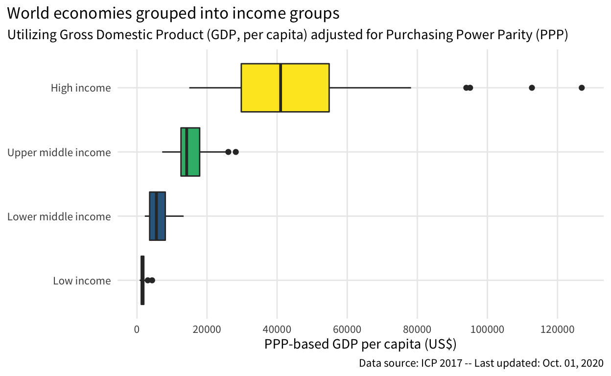
Figure 1: Gross Domestic Product per capita after adjusting for Purchasing Power Parity, categorized by income group
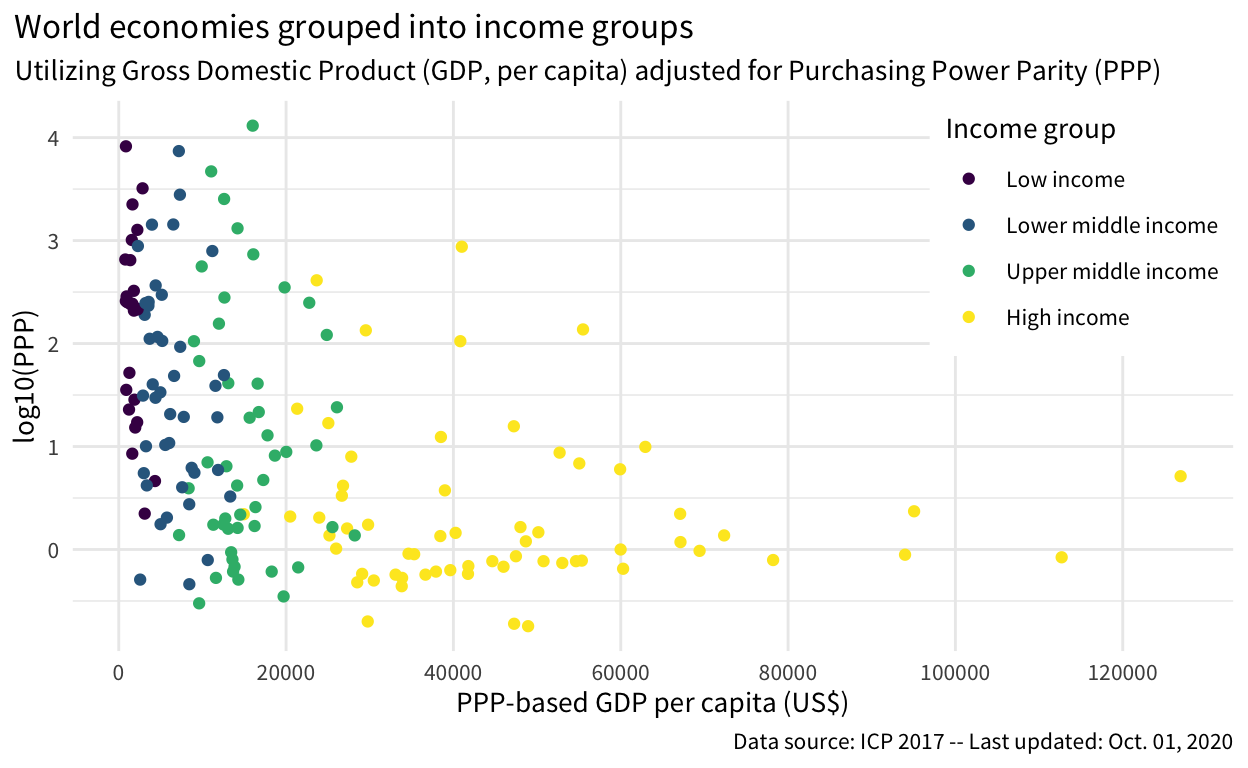
Figure 2: Purchasing Power Parity against PPP-adjusted Gross Domestic Product per capita, and color-coded by income group